by Ian Tee
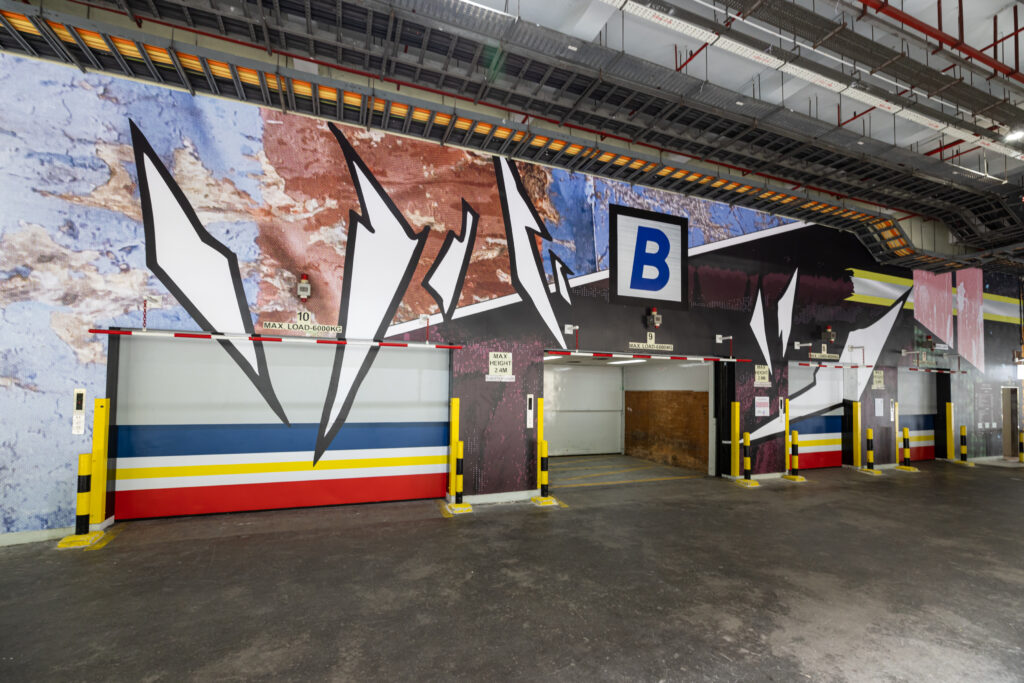
Image courtesy of Singapore Art Museum.
When Singapore Art Museum (SAM) approached me to propose a work for the cargo lift lobby at Tanjong Pagar Distripark (TPD), I was challenged to respond to the space while bringing in my sensibility as an artist working in the field of painting. I knew the composition of the work needed to take into consideration the architectural features and fixtures that are part of the everyday function of the lobby. This included the safety rails, lights, moving lift doors, painted stripes on the floor, as well as overhead pipes and tracks. They all carry an industrial aesthetic language in their form and materials. Through the lens of abstraction, one can also see these features as fixed lines and proportions that frame the space. Putting on my painter hat, I could not resist attempting to solve this “problem” of composition.
Expanded field of painting
![]()
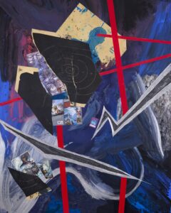
1 – Ian Tee. FEDALLAH. 2023. Acrylic paint, target papers, comic book pages, reflective tape, collage on destroyed aluminium composite panel, 180 x 150cm. Image courtesy of the artist.
2 – Ian Tee. FIRE BLANKET 4. 2018. Woven fibreglass, old clothes, reflective strip, polyester webbing, 182 x 182cm. Image courtesy of the artist and Ames Yavuz.
While the scale of the space is larger than any work I have made in the studio, I wanted to adopt strategies from my painting practice. Collage is one recurring method I have employed across different series. In my work, FIRE BLANKETS, fabrics of different textures and patterns are sewn into a composition that is at once balanced and dynamic. Recent collage paintings on aluminium like FEDALLAH draw on the ways in which comic book aesthetics create a sense of movement by using action lines and fragmented panels. I enjoy analysing how visual components come together, what makes them work and the cultural meanings we associate with them.
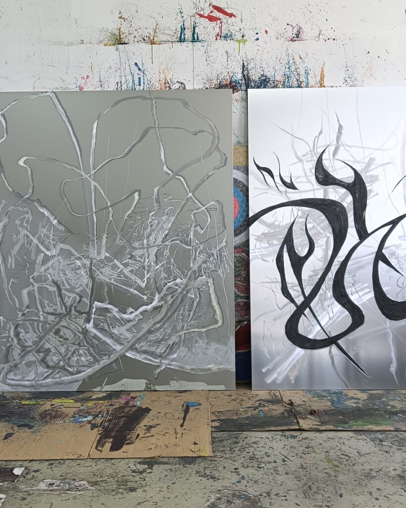
A look inside Ian’s studio, 2024. Image courtesy of the artist.
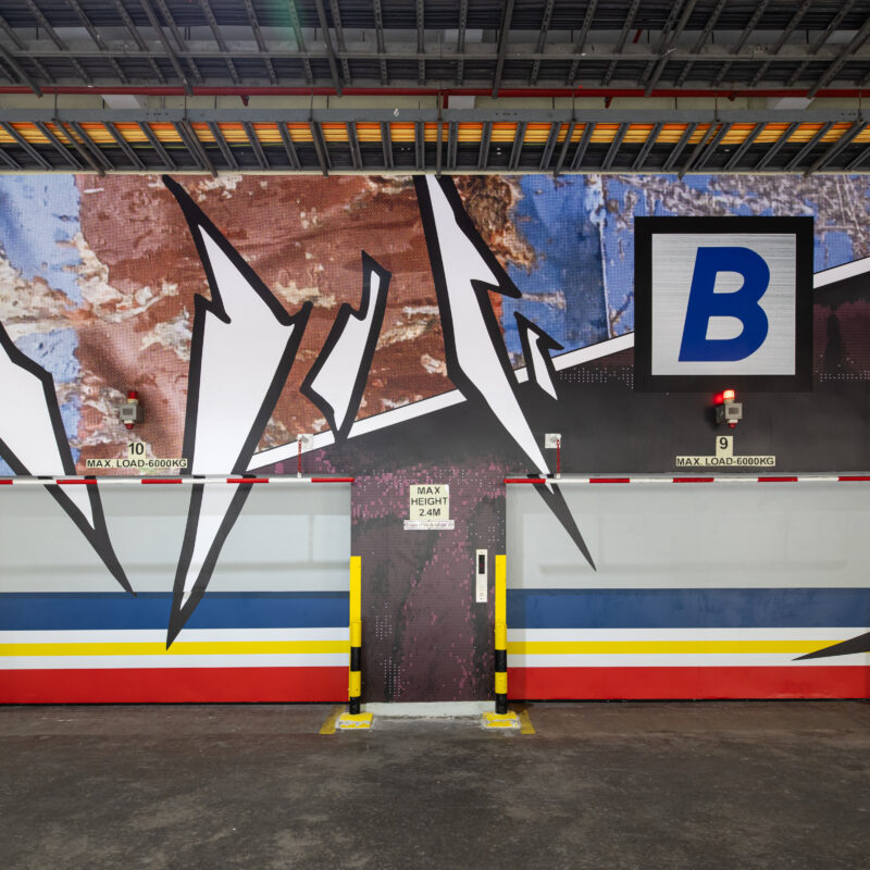
With DEEP CUTS, my intention is to engage with the existing architecture while embracing the flatness of painting. As the cargo lift lobby is an active space, I wanted the mural to suggest that sense of speed and energy. DEEP CUTS structures the long wall like a graphic novel, using the lift doors as “boxes” within a larger composition. Diagonal lines break up the hard right angles in the space and keep the viewer’s eyes moving. After establishing this basic structure, my next step was to think about the textures and images that populate the different sections in this composition.
How to collaborate
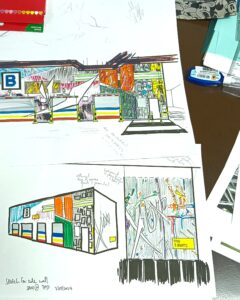

1 – Preliminary sketch proposal for DEEP CUTS. Image courtesy of the artist.
2 – Work-in-progress image showing the digital translation process. Image courtesy of the artist.
For me, the project was also an opportunity to try a different working process and learn something new along the way. Having decided that the artwork will take the form of a printed vinyl mural, I roped in Muhammad Dhiya Bin Rahman (Dhiya) and Jovan Tong as collaborators. We began with a sketch I drew, containing an outline of the overall composition as well as ideas for each segment. Dhiya and Jovan brought their experience working with digital formats as we brainstormed ways to translate my photo references into an abstract design.
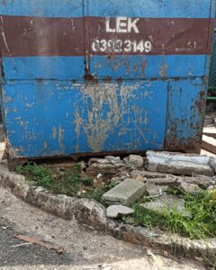
1 – Example of “found” textures around the industrial estate where my artist studio is located. I am drawn to the distressed surface of this metal dumpster. Image courtesy of the artist.
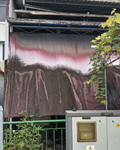
2 – A beautifully sun-bleached awning. Imagine courtesy of the artist.
Each section of the comic book structure is based on textures in my works or found around the industrial estate where my studio was located. As such, I think of them as easter eggs hidden in the mural. This relates to the idea of a “deep cut” as niche references that have dedicated followers. In the context of this mural, there are two types of deep cuts: firstly, elements of my painting practice and visual language such as the use of metal and fabrics; and secondly, nods to the aesthetics of different print and digital media.
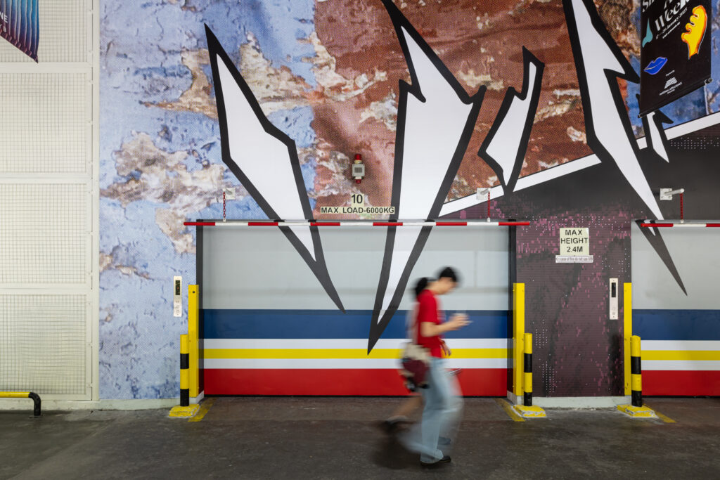
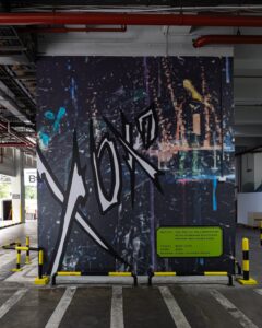
People passing by DEEP CUTS (2025). Image courtesy of Singapore Art Museum.
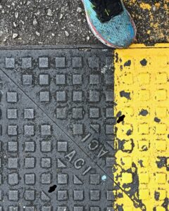
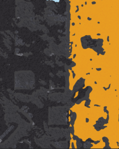
1 – Metal cover on the road with a painted yellow stripe. I like how the surface conveys a sense of weight and ruggedness. Image courtesy of the artist.
2 – We tried to retain the gritty texture while keeping the graphic simple and visually flat. At a distance, the effect recalls an animal print or a camouflage pattern. Image courtesy of the artist.
The aesthetics of digital media become apparent through the process of digitising and transforming images. Dhiya and Jovan were crucial interlocutors as they helped bridge the gap between concept and execution. Often, I would explain the desired effects using visual references such as silkscreen printing or the style of early video games. They would then suggest design possibilities that at times were unexpected interpretations.
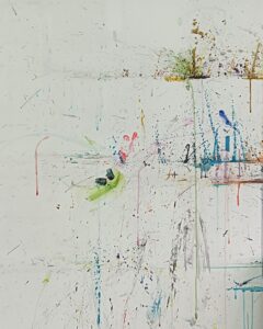
1 – Paint splatters on Ian’s studio wall. Image courtesy of the artist.
2 – Transformed image seen in DEEP CUTS (2025), with two layers of pixelated treatment. Image courtesy of Singapore Art Museum.
One such example is the side wall, with a giant XOXO graphic and an artwork label rendered to look like the text box in early Pokemon games. The background is based on an image of my paint splattered studio wall, and I wanted to transform it into a kind of pixel art. Dhiya came up with a design that speaks to the concept in two layers, where the outlines of each paint drip look like blocks from afar. At the same time, upon closer inspection, fine details of the original splatters are retained and transformed into miniscule digital “stains.”
Abstractions on paper, on screen, in-real-life (IRL)
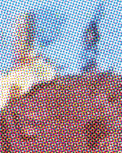
1 – Detail of CMYK dots treatment in DEEP CUTS (2025). Image courtesy of the artist.
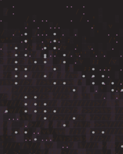
2 – Detail of ASCII treatment in DEEP CUTS (2025), this section is made up of keystrokes in different colours and sizes. Image courtesy of the artist.
I hope DEEP CUTS inspires audiences to pay more attention to the abstraction found in everyday life. By playing with scale and the ways in which this mural is seen, in person and online through digital images and screens, I wanted to show how images can take on very different qualities. When one takes a microscopic zoom into printed paper, one would see that various colours are produced by only a palette of tiny CMYK dots. Similarly, genres like ASCII art provide creative expression inspired by age of early internet art where file sizes were severely limited.
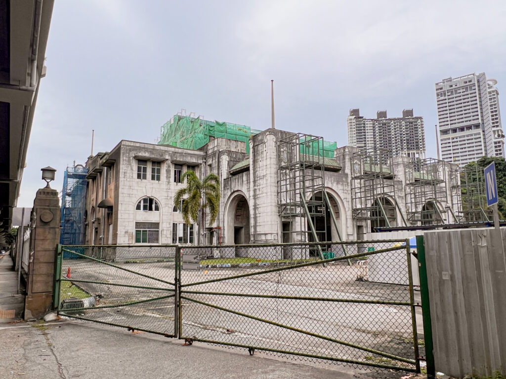
Tanjong Pagar Railway Station (also known as old Keppel Road Railway Station) in 2022. Image courtesy of Singapore Art Museum.
As a nod to the former Keppel Road railway station located across from SAM, I have appropriated the stripes on KTM train cars and applied them on the cargo lift doors. This idea came to me as I thought about the repetition of the lift doors, and how it reminded me of multiple train cars being lined up along the railway. Beyond the visual resonance, the fact that these lift doors are moving parts made the train reference even more meaningful.
To end this reflection, I would like to propose that abstraction is a fundamental part of the experience of seeing that is deeply connected to our common experiences in the world. We should enjoy mundane surfaces, such as a scratched wall or the riot of colours on a clothing rack, the same way we appreciate paintings in a museum. Creative expression and beauty can be found anywhere —the fun lies in paying attention and finding them.
Related